Faux-pyrus!

There's been an impostor lurking around lately. It goes by the name of "Parchment". It looks a lot like Papyrus, but don't be fooled. It's easy to tell the difference if you know what to look for. First of all, the size. Parchment is much smaller in comparison. Papyrus seems to have thinner lines running horizontally. Also, the "E" in Parchment has a shorter top line, and a longer middle line and Papyrus is opposite, with a longer top line and shorter middle line..
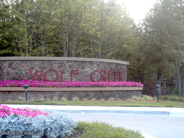
Known users of Parchment (aka. Faux-pyrus):
Timberlan Parc
Wolf Creek
Cobblestone
Edible Arrangements
A slightly modified version is on the movie poster for Serenity
And, it's hard to tell, but I think we have a new submission of faux-pyrus:
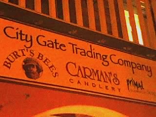
City Gate Trading Company
I had to really look at this one to make sure. But what made me decide was the top of the "G". Look at how it widens slightly at the end. I hate to say it, but that looks to me like bona-fide Parchment.
Remember: Accept no imitations!
Overall rating: B+ (for "Burt's Bees")
posted by Alan at
8:37 AM
![]()

1 Comments:
Parchment is close enough for us to hate it too! I just stumbled on this site thru a digg.com post about bad fonts...and Papyrus has lived on my list of Top 10 Things I Hate for quite some time. I'll have submissions soon...just you wait!
Post a Comment
Subscribe to Post Comments [Atom]
<< Home